Definition/Introduction
Researchers must utilize exploratory data techniques to present findings to a target audience and create appropriate graphs and figures. Researchers can determine if outliers exist, data are missing, and statistical assumptions will be upheld by understanding data. Additionally, it is essential to comprehend these data when describing them in conclusions of a paper, in a meeting with colleagues invested in the findings, or while reading others’ work.
Issues of Concern
This comprehension begins with exploring these data through the outputs discussed in this article. Individuals who do not conduct research must still comprehend new studies, and knowledge of fundamentals in analyzing data and interpretation of histograms and boxplots facilitates the ability to appraise recent publications accurately. Without this familiarity, decisions could be implemented based on inaccurate delivery or interpretation of medical studies.
Frequencies and Descriptive Statistics
Effective presentation of study results, in presentation or manuscript form, typically starts with frequencies and descriptive statistics (ie, mean, medians, standard deviations). One can get a better sense of the variables by examining these data to determine whether a balanced and sufficient research design exists. Frequencies also inform on missing data and give a sense of outliers (will be discussed below).
Luckily, software programs are available to conduct exploratory data analysis. For this chapter, we will be examining the following research question.
RQ: Are there differences in drug life (length of effect) for Drug 23 based on the administration site?
A more precise hypothesis could be: Is drug 23 longer-lasting when administered via site A compared to site B?
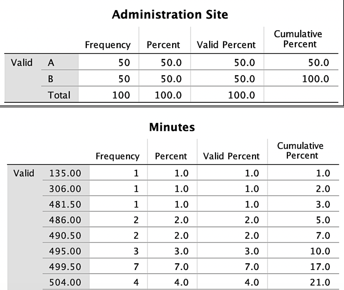
To address this research question, exploratory data analysis is conducted. First, it is essential to start with the frequencies of the variables. To keep things simple, only variables of minutes (drug life effect) and administration site (A vs B) are included. See Image. Figure 1 for outputs for frequencies.
Figure 1 shows that the administration site appears to be a balanced design with 50 individuals in each group. The excerpt for minutes frequencies is the bottom portion of Figure 1 and shows how many cases fell into each time frame with the cumulative percent on the right-hand side. In examining Figure 1, one suspiciously low measurement (135) was observed, considering time variables. If a data point seems inaccurate, a researcher should find this case and confirm if this was an entry error. For the sake of this review, the authors state that this was an entry error and should have been entered 535 and not 135. Had the analysis occurred without checking this, the data analysis, results, and conclusions would have been invalid. When finding any entry errors and determining how groups are balanced, potential missing data is explored. If not responsibly evaluated, missing values can nullify results.
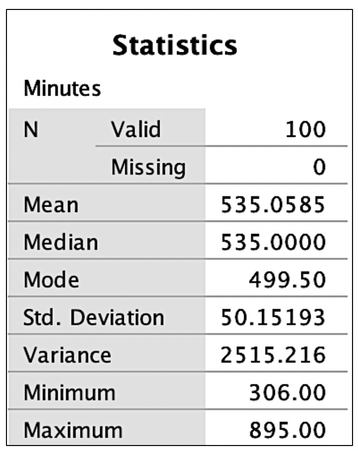
After replacing the incorrect 135 with 535, descriptive statistics, including the mean, median, mode, minimum/maximum scores, and standard deviation were examined. Output for the research example for the variable of minutes can be seen in Figure 2. Observe each variable to ensure that the mean seems reasonable and that the minimum and maximum are within an appropriate range based on medical competence or an available codebook. One assumption common in statistical analyses is a normal distribution. Image. Figure 2 shows that the mode differs from the mean and the median. We have visualization tools such as histograms to examine these scores for normality and outliers before making decisions.
Histograms
Histograms are useful in assessing normality, as many statistical tests (eg, ANOVA and regression) assume the data have a normal distribution. When data deviate from a normal distribution, it is quantified using skewness and kurtosis.[1] Skewness occurs when one tail of the curve is longer. If the tail is lengthier on the left side of the curve (more cases on the higher values), this would be negatively skewed, whereas if the tail is longer on the right side, it would be positively skewed. Kurtosis is another facet of normality. Positive kurtosis occurs when the center has many values falling in the middle, whereas negative kurtosis occurs when there are very heavy tails.[2]
Additionally, histograms reveal outliers: data points either entered incorrectly or truly very different from the rest of the sample. When there are outliers, one must determine accuracy based on random chance or the error in the experiment and provide strong justification if the decision is to exclude them.[3] Outliers require attention to ensure the data analysis accurately reflects the majority of the data and is not influenced by extreme values; cleaning these outliers can result in better quality decision-making in clinical practice.[4] A common approach to determining if a variable is approximately normally distributed is converting values to z scores and determining if any scores are less than -3 or greater than 3. For a normal distribution, about 99% of scores should lie within three standard deviations of the mean.[5] Importantly, one should not automatically throw out any values outside of this range but consider it in corroboration with the other factors aforementioned. Outliers are relatively common, so when these are prevalent, one must assess the risks and benefits of exclusion.[6]
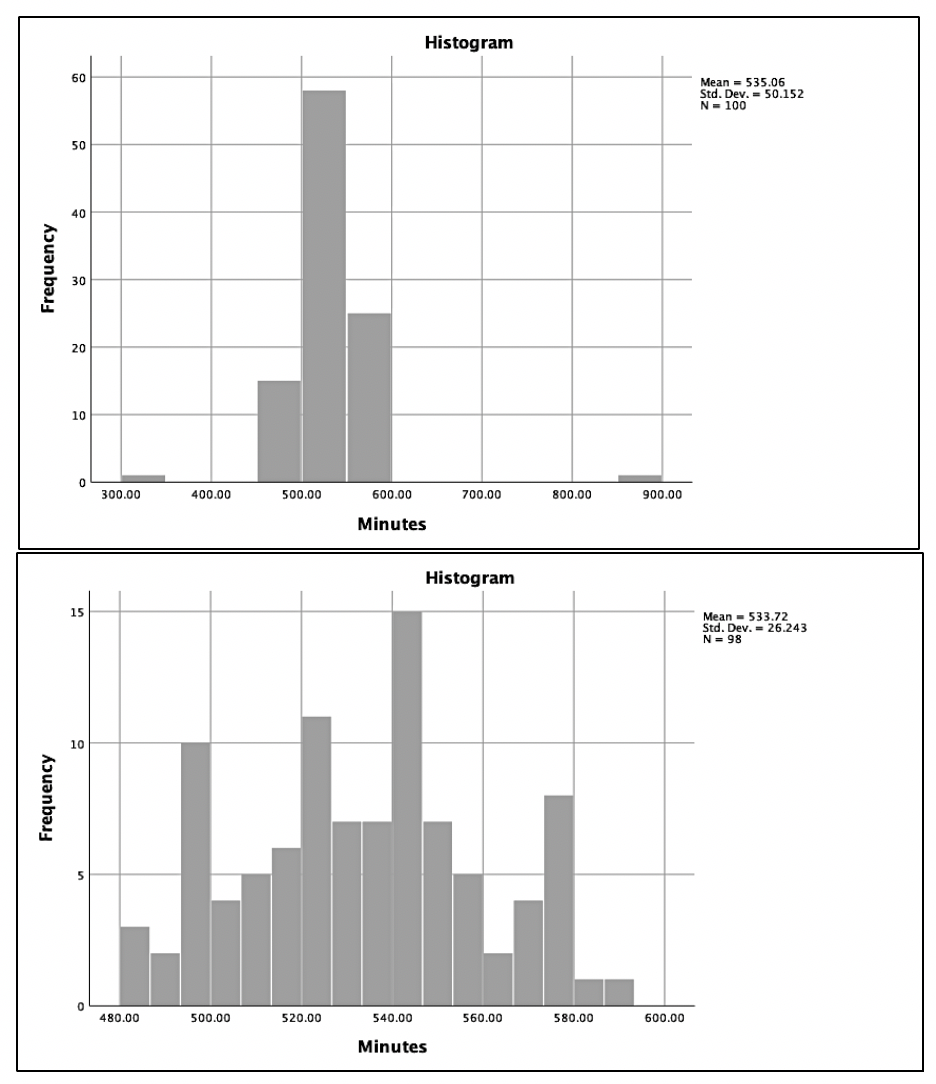
Image. Figure 3 provides examples of histograms. In Figure 3A, 2 possible outliers causing kurtosis are observed. If values within 3 standard deviations are used, the result in Figure 3B are observed. This histogram appears much closer to an approximately normal distribution with the kurtosis being treated. Remember, all evidence should be considered before eliminating outliers. When reporting outliers in scientific paper outputs, account for the number of outliers excluded and justify why they were excluded.
Boxplots
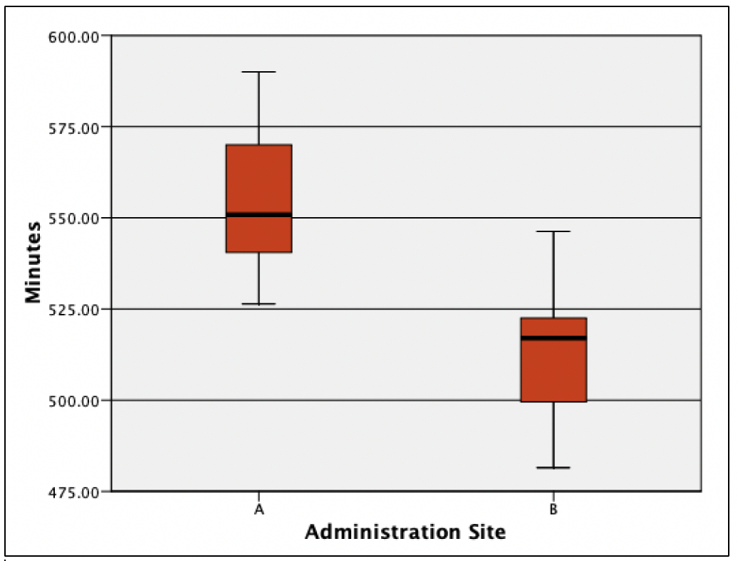
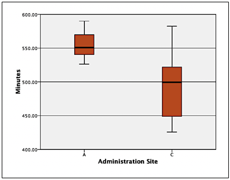
Boxplots can examine for outliers, assess the range of data, and show differences among groups. Boxplots provide a visual representation of ranges and medians, illustrating differences amongst groups, and are useful in various outlets, including evidence-based medicine.[7] Boxplots provide a picture of data distribution when there are numerous values, and all values cannot be displayed (ie, a scatterplot).[8] Figure 4 illustrates the differences between drug site administration and the length of drug life from the above example.
Image. Figure 4 shows differences with potential clinical impact. Had any outliers existed (data from the histogram were cleaned), they would appear outside the line endpoint. The red boxes represent the middle 50% of scores. The lines within each red box represent the median number of minutes within each administration site. The horizontal lines at the top and bottom of each line connected to the red box represent the 25th and 75th percentiles. In examining the difference boxplots, an overlap in minutes between 2 administration sites were observed: the approximate top 25 percent from site B had the same time noted as the bottom 25 percent at site A. Site B had a median minute amount under 525, whereas administration site A had a length greater than 550. If there were no differences in adverse reactions at site A, analysis of this figure provides evidence that healthcare providers should administer the drug via site A. Researchers could follow by testing a third administration site, site C. Image. Figure 5 shows what would happen if site C led to a longer drug life compared to site A.
Figure 5 displays the same site A data as Figure 4, but something looks different. The significant variance at site C makes site A’s variance appear smaller. In order words, patients who were administered the drug via site C had a larger range of scores. Thus, some patients experience a longer half-life when the drug is administered via site C than the median of site A; however, the broad range (lack of accuracy) and lower median should be the focus. The precision of minutes is much more compacted in site A. Therefore, the median is higher, and the range is more precise. One may conclude that this makes site A a more desirable site.
Clinical Significance
Ultimately, by understanding basic exploratory data methods, medical researchers and consumers of research can make quality and data-informed decisions. These data-informed decisions will result in the ability to appraise the clinical significance of research outputs. By overlooking these fundamentals in statistics, critical errors in judgment can occur.
Nursing, Allied Health, and Interprofessional Team Interventions
All interprofessional healthcare team members need to be at least familiar with, if not well-versed in, these statistical analyses so they can read and interpret study data and apply the data implications in their everyday practice. This approach allows all practitioners to remain abreast of the latest developments and provides valuable data for evidence-based medicine, ultimately leading to improved patient outcomes.